Liveclicker
UI/UX design
After an acquisition, Liveclicker came to us looking for an updated and solidified brand expression to better fit within their collection of brands that also includes Campaign Monitor and Emma email marketing.

Finding the magic✨ in email marketing
Liveclicker's target audience is marketing professionals who spend a lot of their time writing, curating, and managing emails to customers. And email—dare to say—has not historically been all that exciting. It's typically flat, lifeless, text and images trying to get you to buy something. Yawn.
But that's where Liveclicker is different. They provide a service that makes email come alive and truly feel, well, magical. After running a branding workshop with the client team it became clear that their core brand archetype should be the Magician, and we leaned into this aesthetic heavily.
Making magic happen
I first constructed a new sitemap and key user flows based on insights gathered from the branding workshop and stakeholder interviews. I also modeled the taxonomy of the site largely after the other sites now part of the same brand umbrella for consistency (and ease of development, since it'd be the same dev team tackling this site as the others already built).

Behind the scenes
Liveclicker is a complex service and there was a LOT of content about it on their existing site. The client didn't want to remove any since it was all valuable, so one of the challenges for me was reorganizing it all into smaller, more understandable (and glanceable) sections. A key place we did that was on the Features page—previously this was a looooong block of words explaining every single feature. For the redesign, I grouped them into similar buckets and recommended that the text blocks load in one at a time as the user scrolls so it doesn't become so overwhelming.
Putting it all together
An additional challenge of this project was that all this website work was happening in parallel with a rebranding effort. With each revision to the logo, we also had to update the site UI to maintain consistency. After a few rounds of wireframes and nailing down the brand look and feel, we were finally able to move into final site designs.

Show not tell
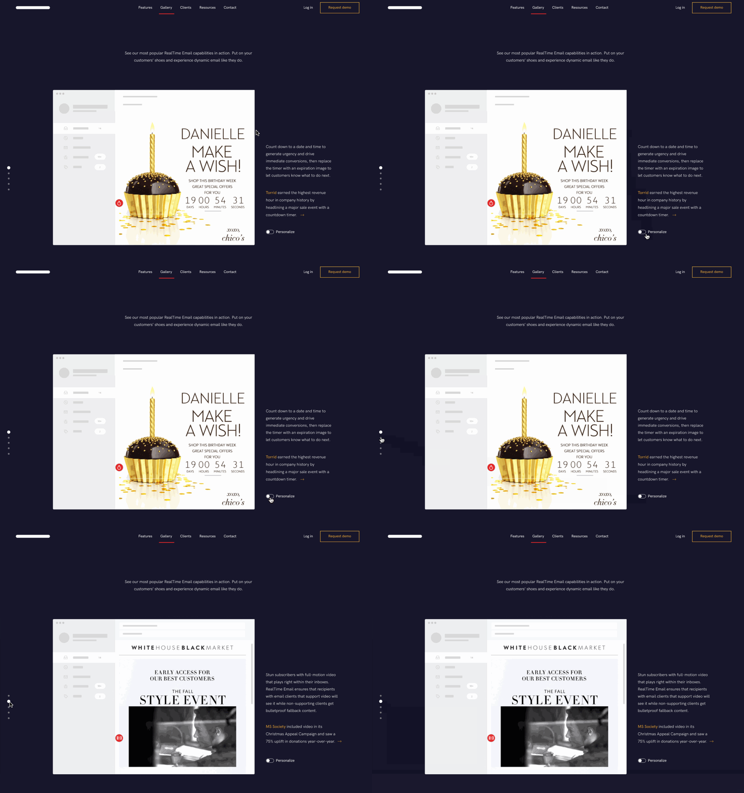
Liveclicker's service is the type of thing that's hard to understand abstractly, so we wanted to make sure customers could actually *see* the value (without having to reach out for a demo). We repurposed the Gallery page of the site (previously a Pinterest-style scrolling page with lots of examples of emails... but mostly static) to better demonstrate the interactivity and power of Liveclicker's dynamic emails.
We highlighted key features being used in past clients' emails, helping customers envision how this could work for them (and how easy it would be to customize).

In the details & meaningful motion
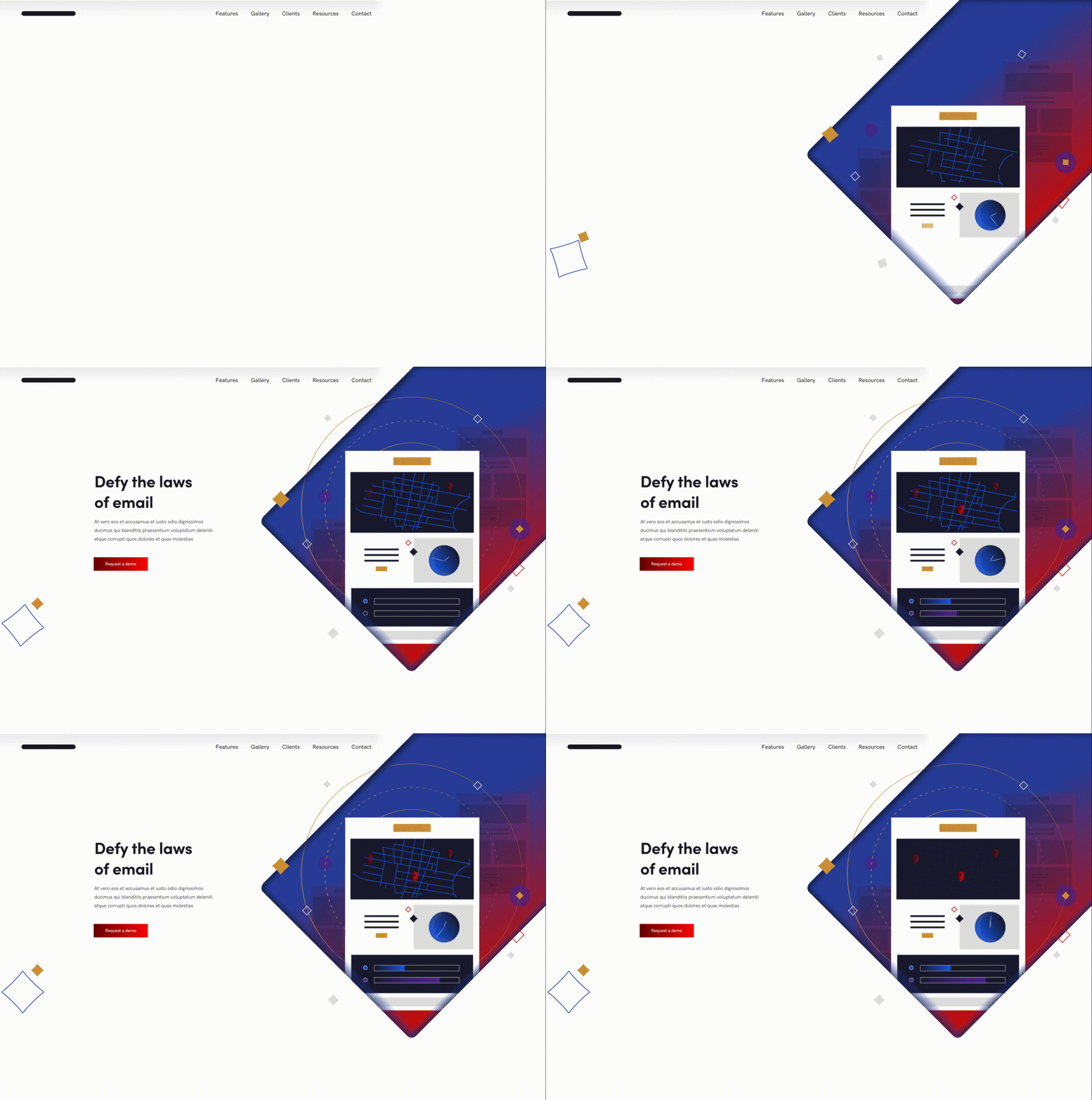
Motion was a key part of communicating Liveclicker's value and offering. We wanted their marketing site to be a taste of how interactive the web can be (even emails). Sprinkled throughout the site are intentional moments of movement, from an eye-catching animated header to subtly pulsing circles around the page CTA, we used motion to draw viewers' eyes to the most important parts of each page (without distracting them from the actual content).

