redpepper website
UI/UX design | Branding
It's true what they say—being your own client is sometimes the hardest work to do. The site hadn't been updated in years and didn't really reflect the growth that the agency had gone through recently, which made it harder to get the types of clients redpepper was looking for—industry giants like Mars and Verizon, and crush brands like Slack and MailChimp.

Screenshots are fun and all, but check out the live site at redpepper.land for the full experience (you might even see me in a few of the photos 👀)
Goals
Better position the agency to attract larger clients by showing off capabilities and a track record of results
Demonstrate how redpepper is uniquely creative and different from other, seemingly similar agencies in Nashville (and across the country)
Make the website as fun and engaging as the culture in the actual building. Because it's really neat, y'all.
Diving in, head first
We started the process with a mini brand workshop with our “clients” (the VP of Marketing, CEO, and COO) to dive into what they were looking to achieve with a new website. From that discussion, we landed on two main audiences:
1. Marketing Directors who are looking for a new agency to work with
2. Prospective employees who want to work at redpepper

After aligning on the primary audiences and user flows, we started putting some pixels on paper, er, Sketch. Based on existing content and input from the “client”, the team and I put together a handful of wireframe options for the main page types—homepage, culture page, and a case study page. The goal was that by solving for these main pages, we'd have enough components to reuse across (most) every other page we'd build from there (and since all this work was happening primarily after hours and in our free time, efficiency was key 🔑).

Exploration, options, and rationale
We made... a lot of stuff. And with several designers working on this collaboratively (shoutout to Bri Moran and Ily Phelps), we really pushed Sketch and our MacBooks to their performance limits on this project (not unrelated, we soon after switched to Figma).


But why stop there?
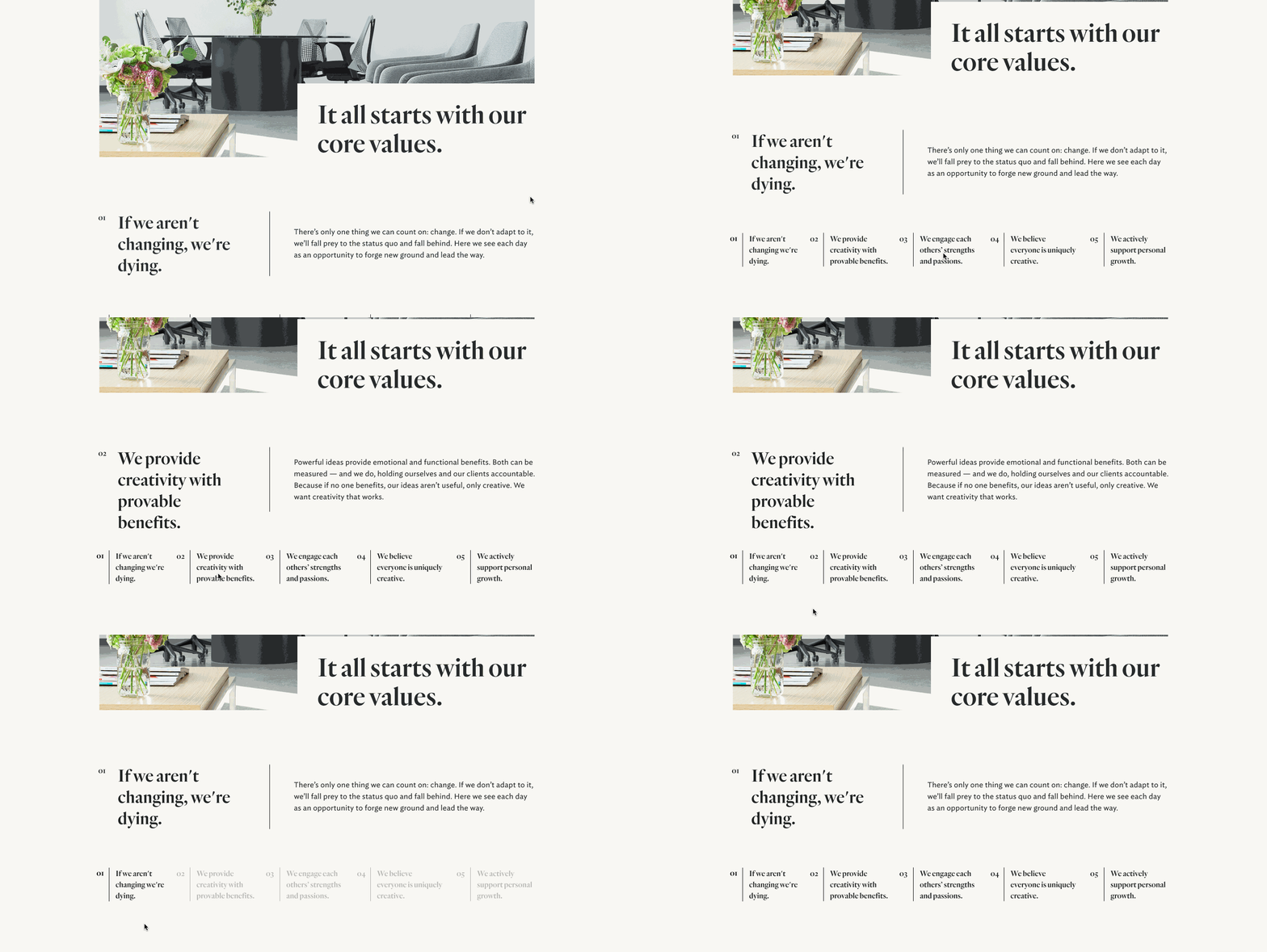
After we were able to hand off the bulk of the site designs to our dev team, we continued working on iterating and continuously improving the UI and UX of the site. For example—the first version we shipped of our core values section was fine by most standards and communicated what we wanted it to, but we felt like it could still be better. Below is an exploration of how that section could become more interactive and engaging in the future.
