
Redesigning Field app to reduce friction and unlock scale
Creating a clearer, more scalable foundation for Asurion Experts' daily work
Problem
The Asurion Field app had outgrown its 2019 MVP foundation. Its architecture buried features and blocked the business from quickly scaling new capabilities. 1,500 experts relied on it daily to complete ~1.2M same-day delivery jobs per year — yet adoption of new features was low and tech debt made iteration increasingly costly and slow.
Solution
I led a structural redesign of the app's information architecture, introducing a homepage and bottom navigation system, and reorganizing the experience around expert workflows rather than system logic.
Impact
- →Improved operational efficiency at national scale
- →Training time reduced from 3 days to <1 day
- →Reduced reliance on coaches and help desk for manual support
- →Increased feature velocity and positioned for long-term tech debt reduction
THE CHALLENGE
The app worked — until it didn't
By 2025, the Asurion Field app was doing what it had been built to do in 2019: power same-day delivery and setup appointments for customers filing phone insurance claims. On paper, it worked. Experts could complete their jobs. The business continued to operate. But underneath that surface stability, the cracks were widening.
Accumulated tech debt created constraints that negatively impacted not only what we could build, but how fast we could deliver it
The app's IA wasn't intuitive and required a lot of upfront training to teach Experts where to find things
The business was hesitant to invest the time into fixing something that they didn't see as obviously broken
The app had grown far beyond its original MVP structure. Nearly 1,500 experts relied on it daily to complete ~1.2 million jobs per year nationwide. Yet structurally, it still revolved around a single organizing principle: the job feed. Everything else — performance metrics, sales tools, shift management — either lived inside that feed or was buried behind a hamburger menu.
As we scaled operations and introduced new features, we began seeing a troubling pattern. Adoption was low. Experts weren't using tools they had explicitly requested. In interviews, many didn't even know those features existed.
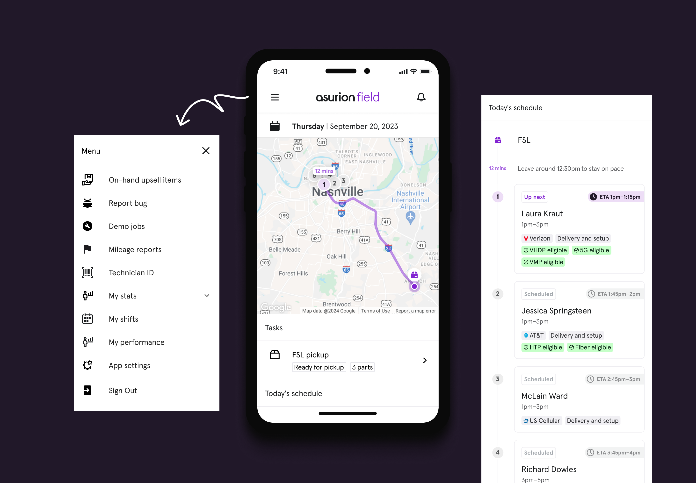
Original app landing page & menu
Training for Field app alone took multiple days of onboarding for new hires. Every new release required additional retraining. Coaches were fielding constant "how do I…?" questions. Meanwhile, engineering complexity ballooned because the backend required everything displayed on the main screen to be modeled as a "job." Workarounds compounded. Tech debt slowed velocity.
We could continue operating. But we could not continue scaling like this.
I had been advocating for a structural redesign for over two years. It repeatedly lost prioritization because it didn't promise direct revenue. But the longer we delayed, the more friction accumulated — for experts and for the business.
Why this work mattered
For experts, the result was high cognitive load during already stressful, time-sensitive days; new features were easy to miss; and learning the app required heavy training. For the business, there was no clear place to add new global features, discoverability made it hard to measure feature impact, and scaling the service meant rethinking the app's core structure.
For experts
- →High cognitive load during already stressful, time-sensitive days
- →New features were easy to miss
- →Learning the app required heavy training
For the business
- →No clear place to add new global features
- →Discoverability issues made it hard to measure feature impact
- →Scaling the service meant rethinking the app's core structure
Securing buy-in for work that didn't have immediate ROI
The hardest part of this project wasn't design. It was convincing the organization that foundational work mattered.
Because the redesign wasn't tied to a near-term financial lift, it kept getting pushed down the roadmap. Rather than wait, I began building the future state anyway. Outside of formal prioritization, I created a high-fidelity vision prototype that reimagined the Field app with clear system anchors, intentional navigation, and space to scale.
I socialized that vision repeatedly — in product reviews, engineering conversations, leadership check-ins. Instead of arguing abstractly for "better IA," I showed what it could feel like. I framed the redesign around expert quality of life and long-term velocity: faster shipping, lighter training, fewer workarounds.
Over time, that narrative gained traction. Trust I had built with product and engineering partners made it easier to push. When the initiative was finally prioritized, it wasn't because it suddenly had financial ROI — it was because the organization understood the cost of doing nothing.
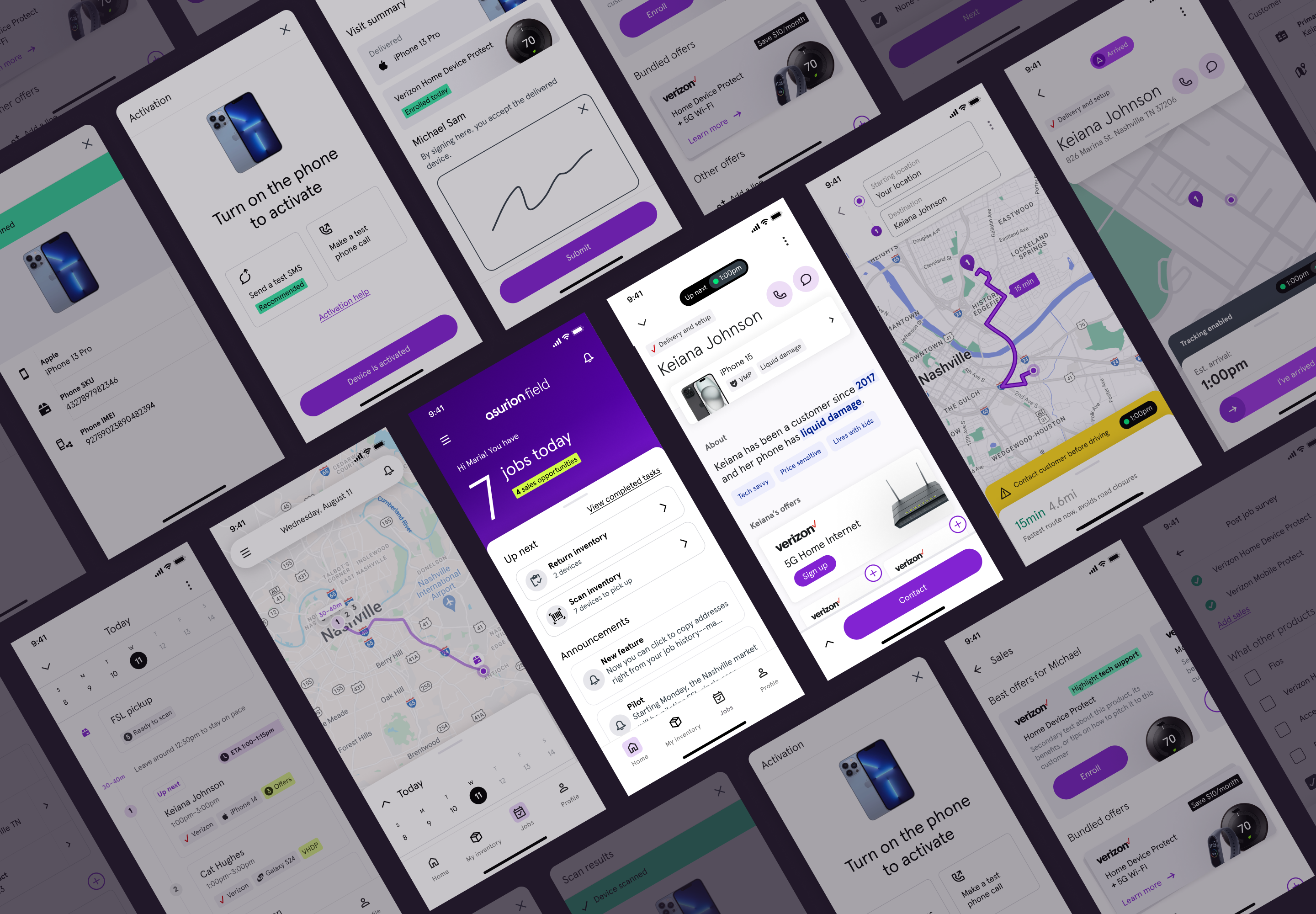
Early UI exploration
THE APPROACH
In-field research revealed the hidden cognitive load
Once formally greenlit, we grounded the redesign in real-world observation.
We conducted ride-alongs, expert feedback sessions, stakeholder interviews across Ops and Sales Enablement, and analyzed years of SUS data. We also examined business metrics — jobs completed per expert per day, sales performance, and NPS.
What surprised me most wasn't what was inside the app — it was what was happening outside of it.
Experts were creating manual workarounds to compensate for structural gaps. Coaches required them to manually copy their daily job list into Microsoft Teams each morning. Finding a Zoom link for a start-of-day huddle meant digging through chat threads. Performance metrics required either navigating buried menus or asking a manager for a screenshot of PowerBI.
These weren't isolated inconveniences. They were signals that our system architecture didn't reflect the reality of how experts worked.
MY ROLE
Driving alignment cross-functionally
I drove the core IA decisions while player-coaching two senior designers — one focused on the Homepage and feed evolution, the other on sales and dashboard integration. Early in the process, I facilitated a cross-functional workshop to align on shared experience principles across design, product, and engineering. That alignment prevented us from solving for features in isolation.
1. One place for everything
- →Experts should manage jobs, track progress, and complete tasks in a single, seamless app. Integrate rather than complicate.
2. Simplicity is the standard
- →A feature isn't done until it's intuitive. Remove unnecessary steps, words, and training barriers.
3. Create a seamless, cohesive experience
- →Navigation, job management, and updates should feel effortless and consistent across all platforms.
4. Guide users, don't just inform
- →Reduce cognitive load with guided workflows, automation, and clear next steps. Prioritize speed, accuracy, and usability.
5. Assume happy path, but provide a way out
- →Design for the ideal flow but ensure flexibility when things go wrong. Experts should always have a fix.
6. Build consumer-grade tools
- →Experts need intuitive, high-quality tools to deliver top-tier service. Our tools should be as polished, reliable, and easy to use as the best consumer apps.
THE SOLUTION
From a single feed to a scalable system architecture
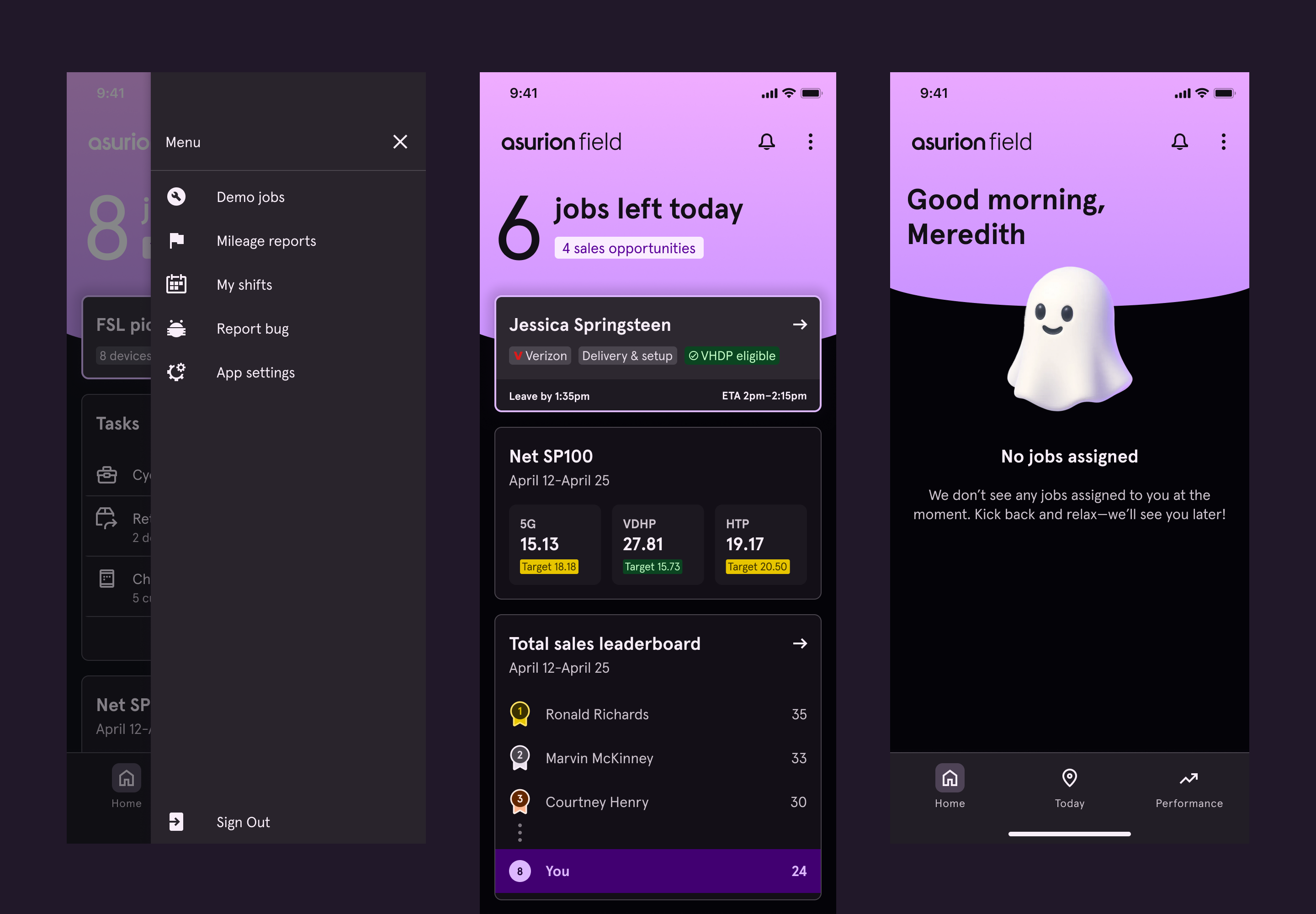
The original app opened directly to the job feed. It had no true top-level navigation. Everything else lived in a hamburger menu or within a job itself. Structurally, it was flat — and brittle.
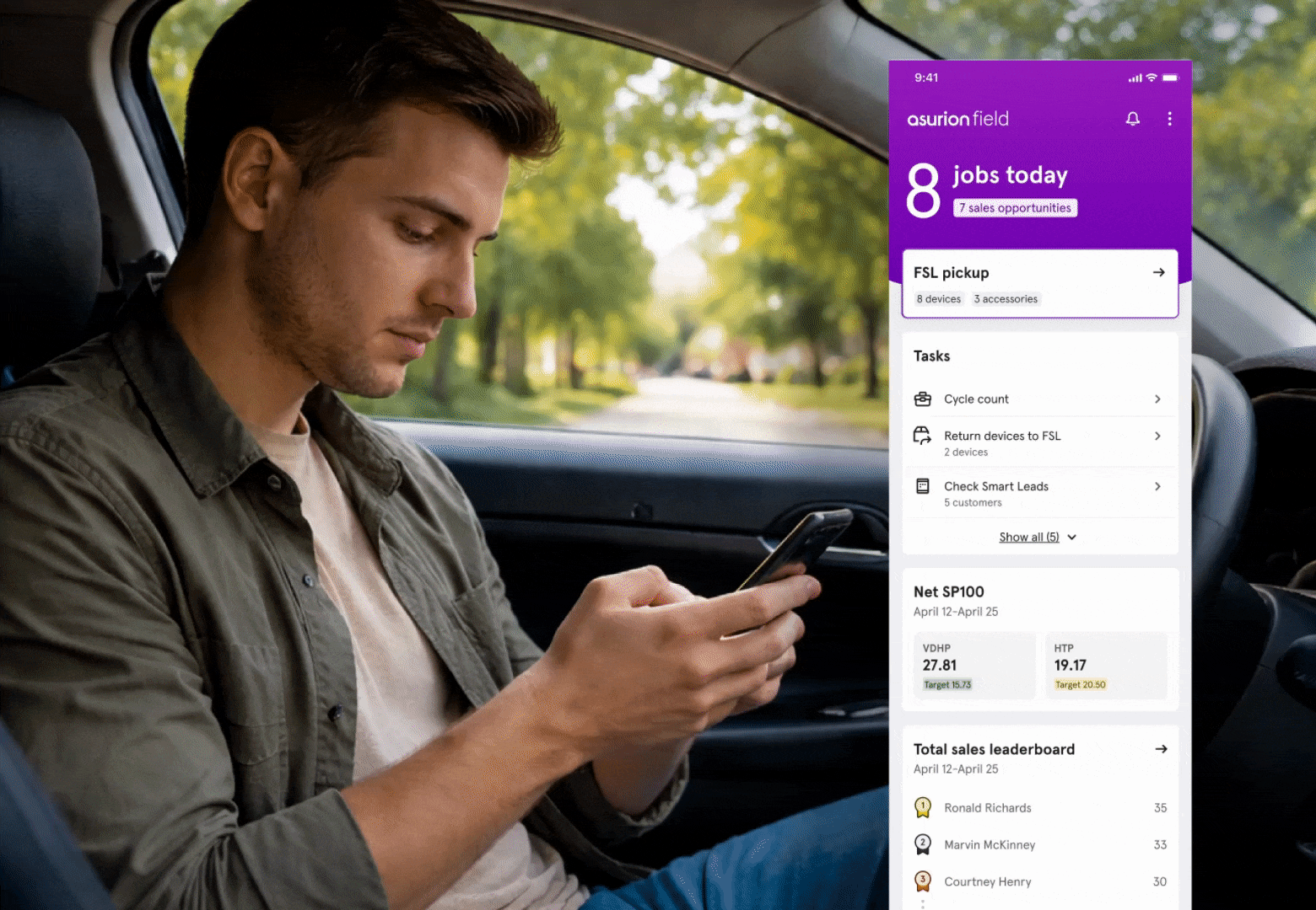
I led the definition of a new IA model using what we had learned from our research, as well as leveraging common patterns out in the wild. We introduced a bottom navigation with three primary destinations: a Homepage, the Job Feed, and a dedicated Performance Dashboard.
The Homepage became a flexible surface for global features — shift management, expense reporting, non-time-bound tasks, and contextual highlights. It gave us a scalable container for capabilities that previously had nowhere logical to live.
We validated the direction through user testing, launched a pilot market, and then rolled out nationwide in a big-bang release approximately two months after formal prioritization.
Dark mode wasn't a trend — it was a safety and usability need
Experts often work at night, in cars, or on customers' porches. A bright interface wasn't just uncomfortable — it could be unsafe. We partnered with Asurion's design system team to define color tokens and usage patterns that supported readability, consistency, and scale.
Those standards were later added to the company-wide system, making dark mode reusable beyond Field.
THE RESULT
Less training, higher adoption, and a system built to scale
Upfront training time for Experts dropped from three full days to less than one. Ongoing feature releases no longer required heavy retraining modules; in many cases, lighter communication sufficed because the system made sense.
Performance dashboard utilization increased significantly once it was no longer buried. Experts started viewing their sales metrics on average 3x more often than before, leading to a 12.5% increase in sales. Navigation confusion decreased, and qualitative feedback consistently reflected lower cognitive load and easier task completion.
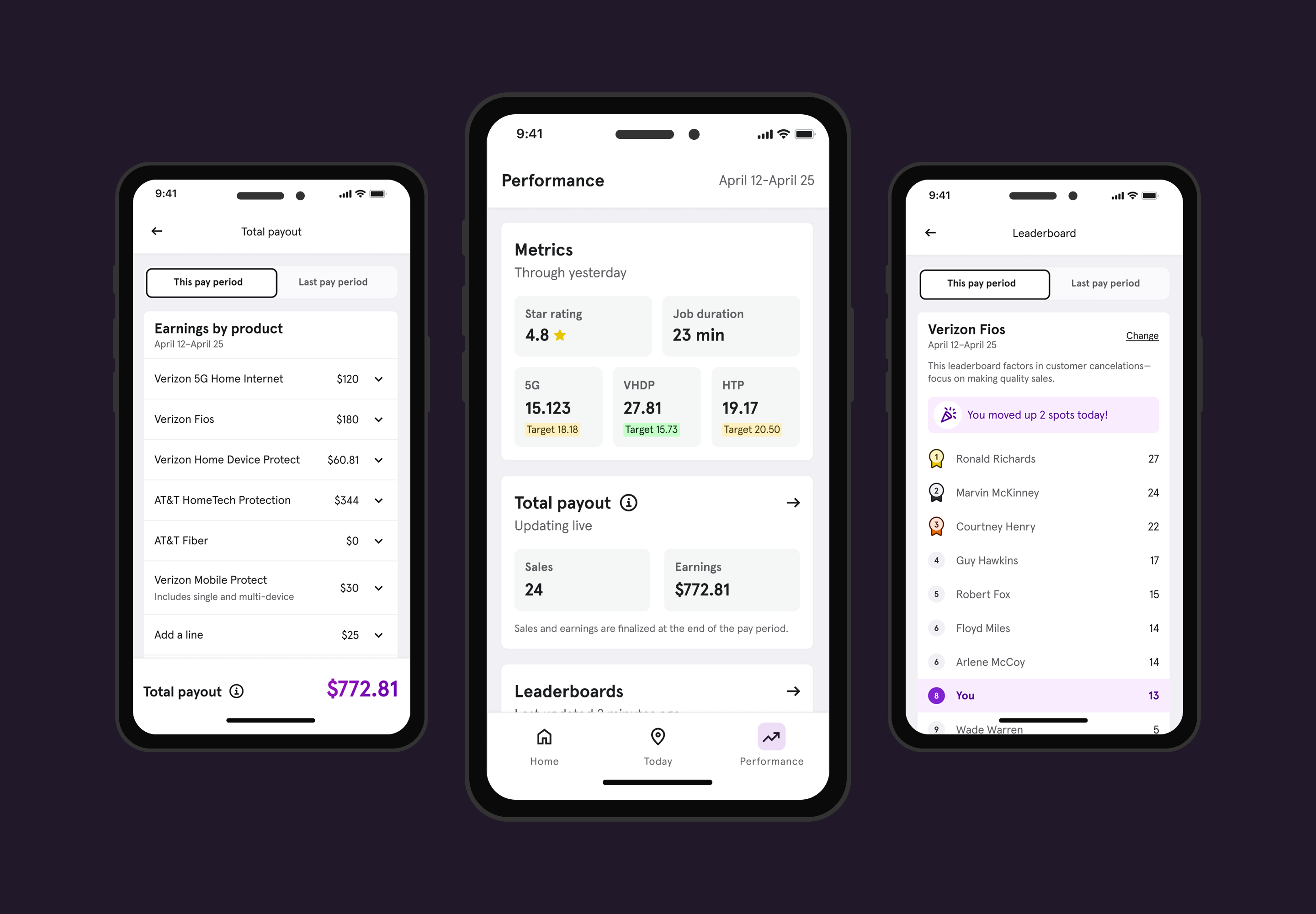
Performance dashboard
At our scale, even marginal efficiency gains matter. Saving one minute per job per expert represents roughly $1.1M in annual value. While we did not eliminate all technical debt in a single phase, we fundamentally repositioned the platform to support faster iteration and sustainable growth.
The following year, the business formalized an OKR around evolving systems and reducing tech debt. We were already moving in that direction and well-positioned to continue the momentum.
…And Experts loved it
Despite a user base known for skepticism toward change, feedback was overwhelmingly positive. Experts intuitively understood where to find things, even though the app had fundamentally changed.
"I definitely like it. Looks a lot better and I can find things a lot better. It's been great so far!"
Expert in Charlotte, NC
"I like the new changes. Everything's in one place you don't have to go look for anything. Nice work!"
Expert in Nashville, TN
"I really like the new design. It definitely is an upgrade, and I love the leaderboard because it shows us where we are at."
Expert in Denver, CO
"I absolutely love the new Field app. Looks up to date! Like the colors and bold heading. Feels more modern and interactive."
Expert in Charlotte, NC
"It's easy to use and a sleeker look. It is aesthetically pleasing while still being functional. I also think it has a better flow."
Expert in Dallas, TX
REFLECTION
What this project strengthened in me as a leader
This work reinforced the importance of long-horizon advocacy. Foundational redesigns rarely have immediate financial metrics attached to them. Selling them requires vision, trust, and persistence.
It also sharpened my ability to operate as a player-coach — defining strategic direction while staying close enough to the work to guide structural decisions in Figma alongside my team.
If I were to do one thing differently, I would socialize the long-term vision more broadly and earlier. The conviction was there, but earlier visibility may have accelerated alignment.
More than anything, this project reminded me that scalable systems don't happen accidentally. They require someone willing to look beneath what "works" and ask whether it will still work at 2x or 5x the scale.
Designing a system that guides behavior instead of policing it
Asurion — 2025
View Next Case Study